Pakistan's widely popular fintech platform NayaPay has revamped its application's user interface and user experience in a recent rebranding round, with the app now featuring a vibrant new visual identity.
The design overhaul is said to be executed to make NayaPay the preferred financial services platform in Pakistan, as it has successfully expanded its user base to over 2.5 million users since its launch in 2022, while broadening its service offerings.
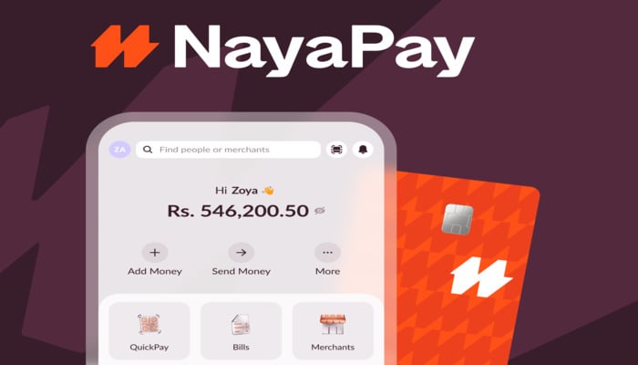
The rebrand has been executed with the help of an international design agency Koto, acclaimed for its work on Amazon’s global brand refresh. It comprises a new logo, a lively colour palette, refined typography, and an upgraded user experience designed to reflect utmost connectivity.
The key to this new identity is the emblem named Dyno, composed of interlocking arrows that symbolise the exchange of money between individuals and businesses, coupled with new wordmark and the signature colour “Electric Orange.”
The redesign also introduces fresh typefaces, a metallic illustration style inspired by currency, and custom icons reflecting the geometric shapes of the logo.
Besides, the NayaPay app has undergone both visual and functional upgrades, including a redesign of the NayaPay Visa Physical and Virtual cards to support modern vertical card formats.
The fintech giant emphasises that the rebrand is not merely a virtual visual touch-up, but is also a big leap towards future developments.


