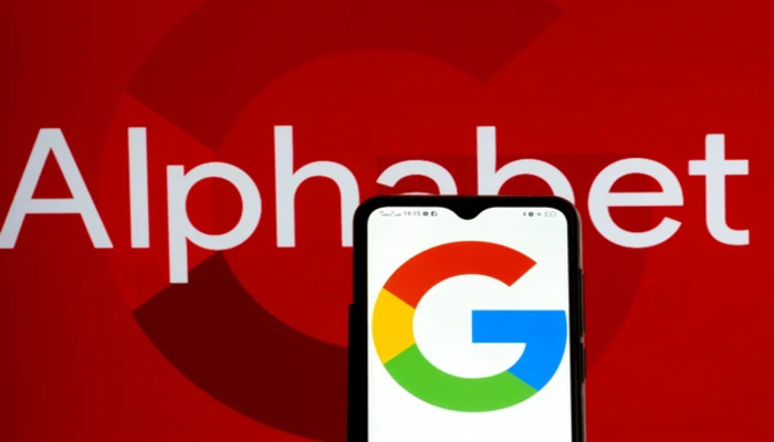
With its annual I/O 2025 developer conference scheduled for 20 May, Google seems to have garnered all the traction of the landscape by refreshing its iconic ‘G’ logo for the first time in nearly a decade.
Google's redesigned "G" icon reflects a smooth and vibrant blend of Google’s signature colours, including red, yellow, green, and blue. The new Google logo has also replaced the solid blocks featured in the previous design.
It's worth noting that the new design is visible in the latest Google Search app update (version 16.18 beta) on Android and iOS. The rollout of the redesign indicates the company’s shift towards a wider inclusion of AI across its product ecosystem.
Inspired by Google's recent AI developments, including Gemini and other AI tools, the updated logo aims to present a more modern and dynamic aesthetic.
It also marks the most significant change to the "G" symbol since 2015, when Google opted for the Product Sans typeface and introduced the multicoloured capital "G".
The redesigned "G" is vividly visible only within the Google Search app and has become the homescreen icon on mobile devices. The company has not yet confirmed whether other apps, such as Chrome or Maps, will be fortunate to be braced with it.


