Google Maps, one of the most widely used navigation apps, has undergone a subtle visual update on Android and iOS.
The app, which has guided countless individuals through the use of traffic, public transport, and unsure cities, features a new logo in the corner of the map; maybe you've already spotted it.
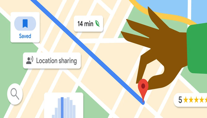
Google Maps' new update
Previously, Google Maps had an iconic four-colour "Google" logo (in a white outline) that existed in the bottom left corner of the map screen.
With the update, this appearance has turned into a “Google Maps” wordmark shown in a more modern style, only featuring black or white letters based on whether your device is set to light or dark mode.
The word "Google" has a bolder appearance than the word "Maps", coinciding with the branding appearance shown in other Google products, and while this is a small change, it helps create a more consistent, polished appearance.
Additionally, the logo minimises visual clutter on the busy map appearance and also busy fullscreen mode, when users swipe up on the search bar.
Overall, the revamped Google Maps logo is shown on all devices including tablets, foldables, and desktop - although in some devices its placement of the logo may be slightly different depending on the screen size.
On larger screens, the logo moves to the centre of the bottom bar.


