Google Messages has integrated a small colour tweak to the upcoming redesign of rich communication services (RCS) read receipts, making the indicator bold. The original design had a circular background, and the read receipts matched the rest of the bubble.
Meanwhile, in the dark theme, the checkmarks (and ellipses) were white, like the text of your message.
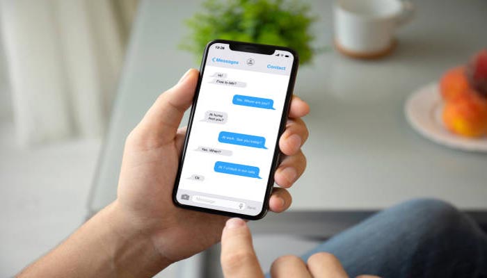
Google Messages recently upgraded its design, making read receipts significantly more noticeable by adopting a white background. This change improves visibility, but it might feel a bit bold, especially when your message is short.
Google Messages began launching the read receipts redesign in August. The indicator moved from the bottom-right corner of the message bubble, while you now view timestamps and end-to-end encryption status by swiping left.
More beta users got the server-side update in November, but it’s not yet widely rolled out. This bolder colour tweak was rolled out earlier this week for Google Messages users who have the new read receipts.


