An undated image of YouTube Music features. — YouTube Blog/Canva
YouTube Music is rolling out a major redesign for its Now Playing screen on Android and iOS. The update comes with a new design, a new dual-pane layout, organised controls, and a more enhanced experience focused on making streaming music simpler and faster.
The redesign, which was first noticed in testing back in November, shifts several elements to create a cleaner interface.
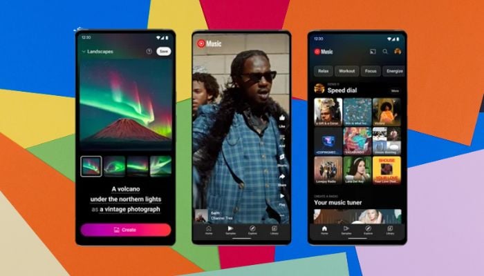
YouTube Music's Now Playing redesign
Reportedly, the Song/Video switcher has moved from the top, and the controls have moved higher up on the screen. The old playhead has been replaced with a new boxy progress bar that gets thicker with the user's touch, giving it a more modern feel.
Possibly the biggest change is the new dual-pane “Up Next”. Users simply have to tap or drag that section to view upcoming songs, playlists, or radio queue instantaneously.
In the Up Next window, users can see about four tracks that they can expand for a full view. The Up Next panel will automatically collapse after leaving Now Playing to keep things tidy.
Other redesign changes include a compact carousel for actions like thumbs up and thumbs down, comments, saving, lyrics, sharing, downloading, and radio. Related songs and lyrics will now open in separate sheets that users can fully collapse.
The update is rolling out via a server-side push, meaning not everyone will see it immediately. If it hasn’t appeared on the user's device, they can force stop YouTube Music from App Info or remove it from the multitasking menu to refresh it.


